How I Make Color Tattoos Pop
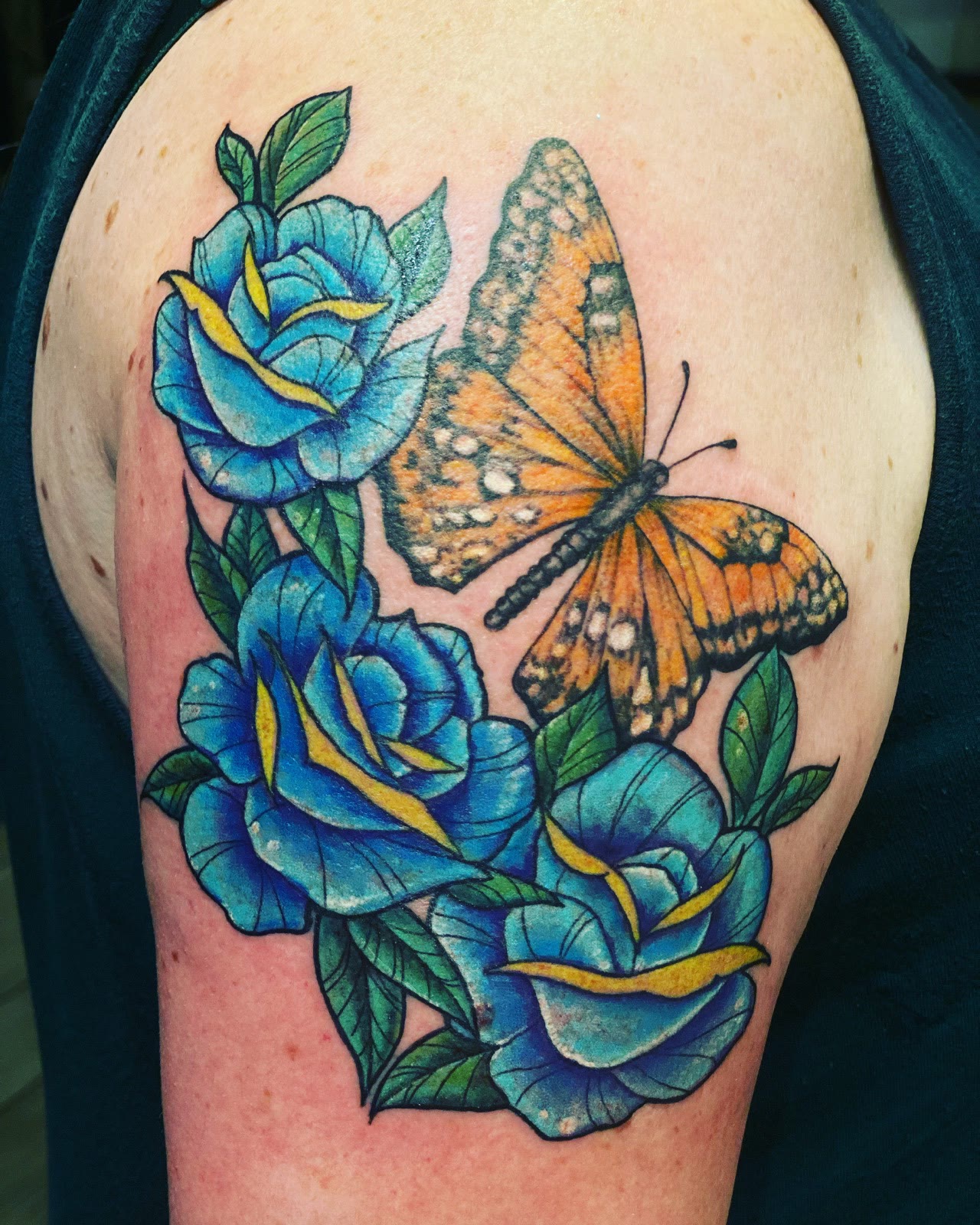
Color is the fastest way to make people stop at my station. When a fresh piece leaves my chair at Club Tattoo inside The LINQ and the whole waiting area leans in, it's almost always a color tattoo. That pop is not luck, and it is not a filter. It's a few decisions made on purpose, every time. Here they are.
Pack the color in
Saturation comes first. I pack the color in well, deep and even, so every section reads solid instead of patchy. Thin color reads washed out. Packed color reads confident. I keep the palette tight and pack the color deep, so the piece stays vivid long after it settles.
Packing color well is slower than it looks. It means working a section until it's genuinely full, and knowing when it is. Overworked skin doesn't hold color better. Full is full, and then you move on.
Put opposites next to each other
The second decision is contrast. I put contrasting colors against each other so the piece pops: warm against cool, bright against dark. You can see it all through my gallery. Blue roses under an orange butterfly, where each color makes the other louder. A pink flamingo with a bright green eye. A traditional tiger head covered in red hearts. None of those pairings are accidents. They're the reason your eye goes where it goes.
Keep the palette tight
More colors do not make more pop. Past a point they cancel each other out, and the piece turns into noise. I keep the palette tight: a few colors, each with a clear job. One carries the piece, one or two push against it, and everything else stays out of the way. When every color shouts, none of them do.
Contrast is more than color
Line weight does the same work. On florals I pull bolder exterior lines and keep the interior detail finer, so the piece has contrast built into it instead of sitting flat on the skin. Thick against thin, dark against light, detail against calm. A color tattoo that pops is really just contrast working on every level at once.
Watercolor, without the washout
Watercolor is where people get nervous, because soft edges get mistaken for weak color. Not in my chair. My watercolor pieces are color blended like it came off a brush, edges left soft on purpose, but the softness lives in the edges, not in the saturation. Underneath, the color is packed just as deep as in any traditional piece. Soft is a style, not a shortcut.
See it for yourself
Scroll my gallery and find the card that says Color That Pops, then keep going: watercolor washes, full color florals, a peacock feather in blues, greens and purple, a slot machine hitting triple sevens in reds and golds. If you're thinking about a color tattoo in Las Vegas, tell me the placement, the size, and the story behind it. Most pieces are drawn for the person wearing them, and color is where that shows the most.